Colors
In Reverb, colors are a hierarchical structure, used to highlight or emphasize important information or elements, and also to display different states.
Definition
- Color is an important element and provides visual continuity, communicates status information, provides feedback in response to user actions, and helps people visualize data more clearly. Its use varies between the product and the elements present in it;
- Colors also indicate which elements are interactive and how they relate to other elements from their level of prominence. When designing an interface, important elements should be emphasized;
- Colors are the minimum requirement in order to build an accessible experience;
- The combination of primary and adjacent colors helps in navigation and understanding of the interface;
- Each color has specific guidelines for each application. To maintain consistency across Rock Content products, these guidelines must be followed.
Brand colors
How our brand colors were built:
- Accessibility was the starting point in order to add real value to our designs. We reviewed our old palette and tested the contrast of each color in order to see what wasn’t working and unfortunately, a lot of the old colors didn’t perform well on the minimum requirement in order to be accessible;
- We adapted the former palette, trying to reach an accessible value for each color within the same hue family, adjusting light and saturation. Our palette complies with WCAG 2.1 Standard at AA Level contrast ratios;
- By making accessible colors, we are including people with low contrast sensitivity, people who cannot distinguish between certain colors, people with very luminous computer monitors, and many other conditions;
- Our proposal also included internal research and an accessibility test for colorblind people;
- The primary color of the brand, “Bleu de France” was the only unchangeable factor in our studies. We built the whole palette around this color, looking for more harmonious combinations.
Semantic colors:
- When we build digital experiences, colors denote standard value states for messages, such as positive/additive, negative/destruction, or warning/review.
- Our colors are meaningful and their rules are very clear because we want to provide a consistent experience to everyone.
Accessible color pairing
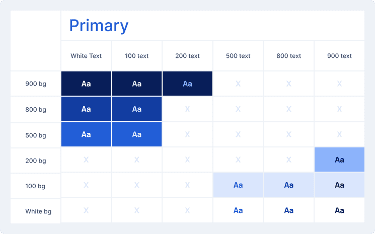
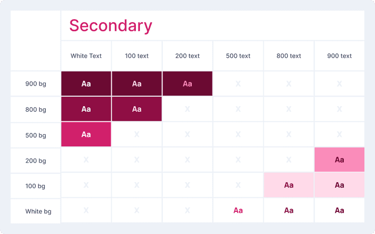
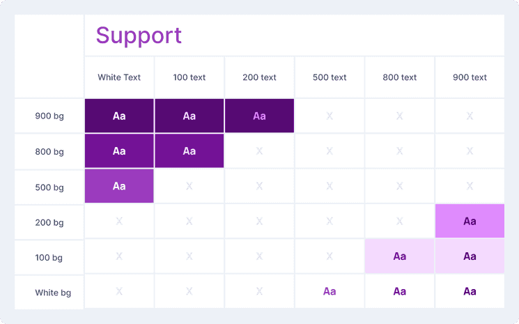
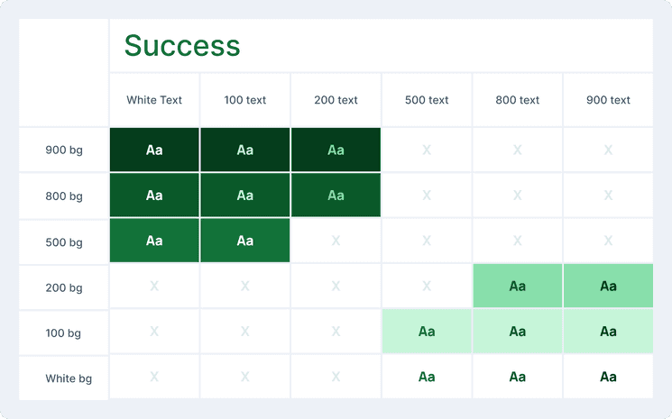
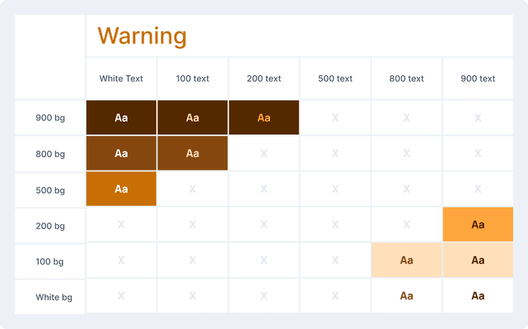
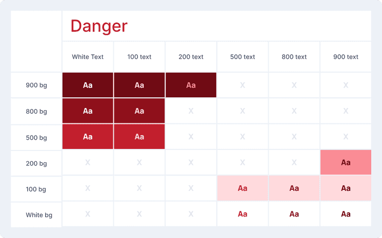
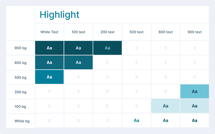
This is how to combine our tints and shades of the same hue:
Primary
Main brand color and used for most call-to-actions like buttons and links.
Secondary
Pulls attention to key indicators to complement primary color elements, breaking up white space.
Support
Used for assistance actions to help, guide or support.
Success
Used for positive messages/graphics and additive actions.
Warning
Used for warnings and actions that need to be reviewed or have the potential to be destructive.
Danger
Used for negative messages/graphics like errors and destructive actions.
Highlight
Used for focus states, drag & drop, and interactive elements.
Neutral
Used for backgrounds, texts, dividers and other neutrals elements.
Color Mode
- Currently, Reverb doesn’t display more than one color mode or theme.
Best practices
- Use color intentionally, color should always be functional and not just decorative;
- All of our colors are also defined as design tokens, so components that aren’t in the library can also use them without having to reset the hex;
- Dark texts must be readable on a light background of their related color (Example: Primary 900 text color + Primary 100 background) to guarantee accessibility;
- To use text over images, add a solid background behind the text or a layer with a gradient and overlay between the text and the image.